Sunday, April 19, 2015

Journalistic Essay | The Royal Ontario Museum

"Why should one expect the new addition to the ROM to be 'business as usual'? Architecture in our time is no longer an introvert's business. On the contrary, the creation of communicative, stunning and unexpected architecture signals a bold re-awakening of the civic life of the museum and the city."
Daniel Libeskind

The Royal Ontario Museum, 1933
 The Royal Ontario Museum (ROM) opened in March 1914 on one of Toronto’s most prominent intersections of Bloor St. and Avenue Rd. It was to be a place of education and discovery with a wide variety of exhibitions acquired from ancient Egypt to the Persian Empire. Since its opening, the original Romanesque building has undergone 3 separate renovations: 1931-1933, 1978-1984 and most recently (and most acclaimed), Daniel Libeskind’s 2001-2007 remodel. With each addition/renovation came a new style and consequently new opinions from many. None received more feedback – in the form of both harsh criticism and praise – than Daniel Libeskind’s new 100,000SF exhibition space.

Libeskind hails from a small Polish town and has been known for his eye-catching, occasionally controversial modern design throughout his career as an architectural principal, professor and theorist. The ROM project came about after a large donation was made available by a foreign museum patron – as it often seems to be the case with high-profile starchitect projects of late. Money was made available, a project was scoped and several contenders from all over the world submitted design plans. The team at Studio Daniel Libeskind submitted a plan that blew away the previously criticized additions of the ROM in terms of the lack of style fusion. Nevertheless, Libeskind was the chosen man for the job.

The winning design was inspired by Libeskind’s first visit to the ROM, when he viewed a mineral crystal exhibition during a wedding that he had been attending. He was fascinated by the unique shape and light-play each crystal contained and determined this allurement was enough to base 100,000 square feet of exhibition space. The original design became the Michael Lee-Chin Crystal and called for six crystal shapes (eventually dropping to five due to budgetary constraints) built from steel and clad in brushed aluminum on the exterior. The interior exhibition spaces take advantage of the strategically placed windows, taking in as much natural light as possible. Throughout the addition, both active and passive green building systems were also implemented. It’s apparent that Libeskind’s addition has many admirable qualities and undoubtedly put the ROM on the iconic architectural map. However, why it has made its way into the debates concerning iconicity and how it is discussed is worth looking further into.

The Queen Elizabeth II Terrace Galleries (later replaced by the Crystal)
Before any additions or renovations, the ROM was an arguably good-looking ‘regular’ building. It was regular in its symmetry, pretty stone façade and typical Romanesque medieval details. The ROM was a Toronto gem but did not garter the attention of world-renowned architectural critics. The first addition included the art deco east wing Byzantine-inspired rotunda and new main entrance. Inside, the rotunda is stunning in its mosaic detail. Outside, it is simply a dome structure neither trying to stand out or blend in with the original building. The second addition that took place in the late 1970’s/early 1980’s revealed the Queen Elizabeth II Terrace Galleries and McLaughlin Planetarium. The terraces were modern, straight-edged and somewhat reminiscent of the brutalist style. All together, the second addition’s style was at least sympathetic to the existing style. Then there is the third addition and suddenly the ROM becomes a global architectural icon…


Why is the ROM considered iconicIt’s interesting to recognize the fact that the word ‘icon’ isn’t quite associated with the ROM until a starchitect is brought into the picture. The third addition to the ROM is an outrageous one if you consider the complete lack of style blending. The uber-modern crystal motif that Libeskind brought to life truly is beautiful in terms of the technical and engineering complexities it took to build it. So could any eccentric design plopped next to the ROM achieve the same level of popularity? Or could the exact same design hypothetically designed by a lesser-known architect reach iconicity? Perhaps the real thought worth contemplating is that this radical addition is truly only discussed as a modern icon because Libeskind put his uniquely unconventional stamp on it.

How is the ROM discussed within the context of iconicityNot surprisingly, when researching the ROM in terms of its architecture, the results lead with Libeskind. He is the face of not only the Crystal but also consequently the ROM as a whole. The discussion seems to circulate around the architect versus the architecture. Libeskind’s design, Libeskind’s inspiration, Libeskind’s legacy. It’s unfortunate and a concept we’ve discussed often throughout the semester – is the building famous because of the actual building or because of the brains behind the building? The ROM, especially since the Crystal is actually only a fraction of the entire institution, seems to ultimately become unfairly overshadowed by the starchitect; leaving its history and journey to stardom in the background.

Wednesday, April 15, 2015

Photo Essay: Olympic Architecture in Athens & Tokyo


Olympic stadiums in all their grandeur are often built at too large a scale to survive past the Olympic games. Converting them into usable facilities post games takes strategy and careful planning. Some countries have achieved success in this are while others struggled to keep their impressive stadium relevant after the closing ceremonies. Usually there is a certain degree of reimagining or renovating that is necessary to make the stadium usable on a consistent basis as the Olympic games are of such a huge scale the design used to accommodate such a large event doesn’t translate to future uses. 
THEN
OAKA
Opening Ceremonies 2004
THEN
OAKA Stadium 2004

NOW
OAKA Stadium
NOW
OAKA Stadium

NOW
OAKA Stadium
NOW
Olympic Aquatic Centre 
THEN
Olympic Stadium Canoe & Kayak
NOW
Olympic Stadium Canoe & Kayak 
THEN
Olympic Village
NOW
Olympic Village
Athens' numerous stadiums used for the 2004 games are an example of how poor planning can lead to the wastefulness of these buildings. Despite the current state of disrepair you see in the Athens building, the Olympic games actually did improve the city of Athens' infrastructure. For a city dependent largely on tourism, the revenue generated by the 2004 games allowed Athens to invest in new a new airport, new ring roads, a new metro, a new tram system, new trolleys, buses, telecommunications network and power stations.  It is ironic that Athens' slogan for the games was "Welcome Home" for its newly erected buildings are now completely abandoned and the Olympic Village in particular, the actual home base for athletes during the game, did not succeed in its plans to be converted into longer term housing. 
THEN
Tokyo's National Olympic Stadium
On optimistic note, The National Olympic Stadium that was built for Tokyo's 1964 games, which was designed by Mitsuo Katayama originally is set to receive new life with a renovation for the 2020 games. Tokyo's strict building codes enabled the original structure to survive a 2011 earthquake. Now, Zaha Hadid will put $1 billion into its rejuvenation. Still, demolishing this existing, structurally sound piece of architecture is an example of how the demands of such a large scale event as the Olympics causes wastefulness.

NOW
Tokyo's National Olympic Stadium
Tokyo's stadium has enjoyed far more regular use than Athens after the games. 

NOW
Proposal for 2020 Tokyo Renovated National Olympic Stadium
NOW
Proposal for 2020 Tokyo Renovated National Olympic Stadium
NOW
Proposal for 2020 Tokyo Renovated National Olympic Stadium
It remains to be seen whether the money Tokyo plans to pour into their new facility will be well spent as is whether the facility will remain in use after the games. Previously, Tokyo has found success in this regard, using their 1964 facility right up to this day. Perhaps with some renovations and a more concrete plan Athens' Olympic buildings would not have suffered in disrepair. Careful planning and attention must paid in creating such large scale architecture. With a post-Olympic plan as detailed as the originals, these buildings would have a chance at survival. 

Tuesday, April 14, 2015

Journalistic Essay - Gardner Museum

The Isabella Stewart Gardner Museum and it's newly erected addition is a place where old and new, traditional and modern, and history and the present collide simultaneously, juxtaposed and abrasive in a campus-like surrounding of the Fenway-Kenmore neighborhood of Boston, Massachusetts. The museum is tucked just beyond the bustle of Huntington Avenue along the Evans Way Park, adjacent to the Back Bay Pens Conservancy park, and sandwiched between a handful of colleges, universities, and other museums. Designed by Italian architect Renzo Piano, the new museum entrance to the Gardner was completed in 2012 and serves to alleviate the museums administrative and retail offerings from its historic building, Isabella Gardner’s original Fenway Court.

The museum’s addition bears no visual or emotional connection to its maternal host, the existing museum. The existing museum, a grand Venetian-style palazzo, was designed by Isabella Gardner herself to house her personal collection of art, architectural elements, furniture, textiles, music, and artifacts from different cultures and time periods from around the world. The building served not only as a museum, but also as Isabella’s private residence, and features a vast four-story interior green house and a grand flowing floor plan. Each room in Gardner’s original museum overlooks the lush garden greenhouse while displaying artifacts on literally every surface, including the ceiling. Each room is just as elaborate and extraordinary as the next. The museum has a distinct atmosphere that transcends you back in time and allows you to vicariously experience art and history the way Isabella Gardner intended. Isabella opened the doors of her collection to the public in 1903.

When you first approach the museum, your eye is drawn directly to the new addition, which acts as the museums main entrance. An industrialized modern rectangular mass with an oxidized copper and glass facade, Piano’s addition does not fair well with its historical atmosphere nor does it connect with the existing building. The patinated copper finish of the entry facade is reminiscent of the nearby famed Fenway Park and the exterior egresses that wrap the front and sides of the building resemble those used on Piano and Franchini’s Centre Pompidou in Paris, completed in 1971.


The addition was placed only a stones throw away from the back of the existing museum and connected only by a single glass breezeway through the museums courtyard. This design was heavily based on strict guidelines from Isabella’s will that required the museum and permanent collection to be unaltered. Piano addressed his design approach for the buildings location, describing that “the distance creates a dialogue between the two buildings, that is maybe too short and too long, but a nice distance and the right scale.” However, from the outside, an existing stone wall surrounds Fenway Court and its rear courtyard, hiding the breezeway from public view. This creates an illusion that the addition stands alone and is disconnected from the Gardner Museum’s long standing historical appeal. The addition appears to be encroaching toward the existing museum building and looks almost uncomfortably close, causing your eye to want to push the addition down farther away. If not for exterior signage at the main entry and the additions close proximity, one might assume that the addition is a building belonging to a different institution that it is the Gardner Museum’s neighbor. 


The Gardner Museum gained its appeal and reputation for its unique history and approach to displaying its permanent collection but with the modernized new addition, the Gardner has lost a touch of its individuality. The addition has also sparked local and national controversy concerning the preservation of the museum’s historical and individual integrity in addition to remaining within the confines of Isabella’s will. Local Boston Globe Critic Sebastian Smee referred to the expansion as “the deliberately theatrical, disorienting experience Gardner contrived with her original building is not just being altered: It is being openly contradicted by a new ethos of transparency, orientation, and explanation.... One can no longer plunge into the experience of the museum without first being enticed by all the clean, new offerings of the new building.” It seems now, that the Gardner Museum, with it’s new face is just another museum. 


Monday, April 13, 2015

The Role of the Detail in the Design Process

This week’s readings centered around architectural details and their importance in the design process. What is most interesting to me is that as interior designers, we are all overly concerned with details. Details are what make the spaces special to our clients. Yet here we are in week eleven of the semester and this is the first time we are talking about architectural details in a real, substantial way. Why is it that details are so important in interior design but often overlooked when discussing architecture? Are details somehow less important in architecture than in interior design?  Up to this point in the semester, we have really delved into various aspects of architecture, and in the process we have studied so many different buildings. Despite the number of buildings we have researched, it seems like we have focused more on how a building relates to its location, what it says about the company/country who built it, how it affects the local economy, etc than on any specific detail of said buildings. For example, in class we have discussed certain buildings and their facades, though we have not yet gone into as much detail as in the readings this week, in particular Zaero-Polo’s “Patterns, Fabrics, Prototypes, Tessellations.”
               
In “Reading Details: Caruso St. John and the Poetic Intent of Construction Documents” we were able to learn more from an architect’s perspective about the importance of detail in the building process. The architects at Caruso St. John were insistent upon using a particular type of joint to the builders on the project, as that joint was integral to the “poetic intent” of the entire project. This is the first we’ve really heard about just how important the smallest of details can be in conveying the overall intended meaning or concept of a building project. We typically discuss the overall intent of the building or its meaning, but without getting as granular as talking about how a detail has impacted it. After reading this essay, it made me want to re-visit a lot of the buildings we have discussed earlier this semester. It would be a really interesting exercise to go back to the Burj Khalifa or Guggenheim Museum in Bilbao, for example, and re-examine them to determine which details were integral to conveying the essence of the project – which detail, if changed, would have altered the project entirely. Digging into a few additional case studies about the importance of details wouldn’t hurt, as we are a group of students who are particularly interested in how one seemingly small thing can totally change the feeling of a space or project.


I thought this week’s readings provided a valuable perspective on architecture. The selection serves as a good reminder for us to stop and look at the details of architecture, rather than simply the silhouette or the height. The details give us the chance to understand the intent of the project in a deeper sense. 

Journalistic Essay: The White House


The White House is an iconic structure in our nation’s history and psyche; a symbolic fixture in America’s landscape. Completed in 1801 after eight years of construction, it is a historic site of great importance located in the political heart of the United States, Washington D.C.
            Architect James Hoban spearheaded the project and is responsible for breathing life into what would become our presidents’ home. Prior to Hoban coming on the scene, Pierre Charles L’Enfant tried his hand at designing the iconic building, proposing a structure four times the size of what was actually realized.
            After the exterior was completed in 1801 it took two additional years to complete the detail work inside that would help to define it as the revered and classic structure it is. Among the elements painstakingly added were the pediments over the doors, wainscoting, ornamental mantelpieces and a distinctive row of iconic columns separated by arches across the entrance hall. It was at this same time that the parlors on the first floor were named according to the original colors chosen. The Green Room was the first to receive its memorable designation with the Blue Room receiving its name later, in 1838, and the Red Room following in 1848.
            Many of the first ladies have taken their turn in personalizing the interior of the White House. Mary Todd Lincoln most notably overshot the White House decorating budget by $6,700, a third of the allocated $20,000. The misstep reportedly infuriated her husband, President Lincoln, and set the press corps even more against her than they were before. White house historian William Seale summed up the gaffe nicely:
It is an old maxim that you can build a billion dollar highway (…) and no one will say anything but if you’re in public office and you try to change your desk, you’re going to end up on the front page. In presidential décor, one must remember the public eye is fixed on everything you do. (Green, What Will Change Look Like IN White House Décor? NY Times De c17 08)
As Seale notes, the decisions made regarding the White House’s interiors easily come under intense scrutiny due to its presence in the political sphere. This means harsher criticism is heaped on the offender for missteps like exceeding the budget or choosing materials or colors that are not appealing.  In our own homes, it is rare to run into such criticisms. Typically our friends and peers who come to enjoy our home do not arrive with an agenda to criticize the interiors. Therefore, it is evident how difficult putting a personalized stamp on such a public building is a difficult and tricky task. The shared use of the White House, as public property and private home, makes tailoring the aesthetic of the interior to the president or, often first lady’s, tastes a difficult endeavor.  Congress budgets cover $100,000 in “transition costs” for new first families. If the President’s family is to exceed that amount which most do, design decisions would be coming out of their own personal budget. It is hard to justify the cost of some custom furniture today as it is, let alone if you’re leaving it behind for the next first family.


Mrs. Lincoln was also criticized for the lavish bed she purchased for the Prince OF Wales Guest Room. Measuring eight fee long and four fee wide, it featured  an enormous headboard and large footboard lavishly decorated in grapes, grape vines and birds. Several later presidents used the bed although President Lincoln himself never did. Sadly, the Lincoln’s own son, Willie Lincoln, passed away in the bed at age eleven.
Unlike the Mrs. Lincoln, other president’s were conservative with their decorating choices. Gerald Ford chose a very dreary scheme that Jimmy Carter inherited. His oval office remained the same, earth toned design that Ford created out due to budget concerns. Despite presidents’ asserting their opinion occasionally when it came to interior design of the White House, the blame and criticism normally fell square on the fist lady’s shoulders. This happened most often when the President was well liked and therefore blameless.
            Nancy Reagan’s plan to tear down a wall in the Lincoln bedroom and her extravagant china purchase that totaled $210,399 were grounds for such criticism. Those sympathetic to her plight could very well argues there was no one, completely matching, set for the scale of entertaining required of a first lady and her husband therefore the need for the purchase of one master set was justified. Sitting down to diner in your tux and picking up a mismatched fork and knife to cut into your prime rib seems a bit inappropriate. Also in Reagan’s defense, was the detail that she used private funds to decorate. Much of the changes that needed to bed made to the interior were due to a deteriorating structure that was in great need of attention and maintenance. She her used own money to fix floors and replace hardware. And yet that did not vindicate her when it came to the public’s opinion her china purchase.
            The amount of scrutiny the decorating of the White House was subject to was due to its presence in political circumstances of each presidency. Reagan’s expensive taste was amplified by the recession  that was wracking the nation at the time. Likewise, Mrs. Lincoln’s purchases were made against the backdrop of a country at war. Lincoln’s own husband scoffed at the final bill, saying it would be in poor taste to spend such an amount on the interiors when the troops were in need of such basics as blankets. Not surprisingly there were many influencing factors that contributed to how a first lady’s design was received. In the White House the decorating choices were subject to the Congressional budgets, personal donations and the first family’s own budget.

            With a building steeped in such history taking on redecoration was a loaded task. Additional obstacles will always be the public’s opinion, the reception by the press and the political temperature at the time.  My hat is off to each first lady who had the courage to place her own mark on the White House despite the controversy and criticism that loomed close by.

Wednesday, April 8, 2015

Sydney Opera House


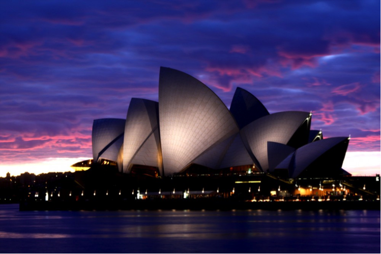
The Sydney Opera House is one of the most iconic buildings of our time. Designed by late Danish architect Jorn Utzon, many consider his design to be a masterpiece of late modern architecture. To simply call it a “building” does not do it justice. Set on the edge of Bennelong Point in the Sydney Harbor, it is a rare architectural sculpture that embodies the essence of its site. From a distance, its distinct form glistens in the Harbor making it one of the most easily recognizable structures ever built in the 20th century. Today it stands as a symbol for Sydney — and Australia — and is treasured and admired not only by Australians but also worldwide. In June 2007, the Sydney Opera House was listed as a UNESCO World Heritage Site, further solidifying its cultural and architectural significance.
The story of the Sydney Opera House begins in 1957 when Jorn Utzon, a relatively unknown architect at the time, unexpectedly won the design competition for the commission of a new opera house located on the Harbor. At first it wasn’t well received. The story claims that if it weren’t for world-renowned architect Eero Saarinen looking through a pile of rejected entries and running across Utzon’s design, we would never know about this architectural wonder. Saarinen declared it genius and vowed to not endorse any other entry. With such a strong endorsement, Utzon’s preliminary drawings were given a second look and became the winning entry. His design was considered unique and inspirational. Nothing like it had ever been built. The biggest challenge was figuring out how to build the “geometrically undefined” curves he envisioned. Nature’s organic forms as well as Utzon’s love for sailing inspired these curves, the shell-like forms that have become so iconic and easily identifiable. As the son of a naval architect, he was an avid sailor and had a passion for the sea. His passion was so intrinsically tied to his design that he used his maritime skills to study naval charts of Sydney Harbor instead of visiting the site, and he used his knowledge of shipbuilding that he acquired from his father to inform his design. These shell-like curves are the roofs of the structure and from afar, they resemble the sails of a boat billowing in the wind, perhaps Utzon’s nod to the function of the Harbor and many boats that pass through it at any given time. The actual construction of the roofs proved to be an engineering challenge, an issue that did not get resolved until two years after the official groundbreaking ceremony in 1961. Utzon himself devised a solution when one day peeling an orange, and redesigned the shells based on the complex sections of a sphere. What we have today are 14 precast concrete shells that according to Utzon, if combined, would form a perfect sphere. From a distance, the shells appear white, but under closer inspection, you can see a chevron pattern made up of millions of glossy white and matte cream tiles that add to its glistening quality. The complex intricacies of the roof required eleven years to complete!

The shell-like roofs

The Sydney Opera House isn’t just one building. The complex actually comprises of multiple performance venues nestled underneath various structures with vaulted roof shells. One set makes up the “concert hall shells;” another makes up the “opera/theater shells;” another houses the restaurant. These shells are set on a monumental podium with terraced areas that serve as pedestrian walkways. The structure is massive, covering 4.4 acres of land, measuring 600 feet long and 394 feet wide (at its widest point). There are six different halls, with the Concert Hall being the largest venue and the Joan Sutherland Theater being the second largest. These two main halls are placed side by side, with their long axis running north to south and slightly veering away from each other. An interesting design feature was placing the auditorium seating facing away from the Harbor. Perhaps this was done to avoid the audience being distracted from the performances by the beautiful view of the Harbor.

Elevation and Plan view. North is on the left.

The other smaller performance venues include the Drama Theater, The Playhouse, The Studio, The Utzon Room (named in honor of the chief architect), and The Forecourt. The latter is a flexible open-air venue where outdoor concerts and community events are held. There are also other facilities in the complex including a recording studio, retail outlets, and bars. In fact, the large terrace of the Opera Bar, located on the south façade, offers phenomenal views of the Opera House and the Harbor Bridge.

The terrace of the Opera Bar
Bennelong Point holds an interesting place in the history of the Harbor. Before the existence of the Opera House, existed Fort Macquarie. And before that, the Bennelong Point was an area filled with discarded oyster shells collected for thousands of years by local Aborigine women. Eventually those shells were re-gathered and burned to make lime for cement mortar, which was then used for construction. I can’t help but think when I look at an image of the Opera House and its shell-like shaped roofs that it is representative of the million shells that once covered the area, as if those burned shells have been given a new purpose — to give rise to this magnificent structure and beautify the Harbor.
And beautify it did. The great American architect Louis Kahn said, “The sun didn’t know how beautiful her light was, until she saw it reflected on this building.” Soon after it formally opened in October 1973, the Sydney Opera House quickly became one of the most distinctive landmarks in Sydney and one of Australia’s biggest tourist attractions. In a given year, over 7 million people visit the Opera House. Approximately 1 million people attend the 1600 performances hosted in the various venues, from musicals to ballets to operas.
It’s unfortunate that Utzon did not get to lead his creation to the very end. He resigned as the architect of the project when conflict arose with the new government and their criticism of the costs and scheduling overruns of the project. Other architects stepped in to finish what he started, changing part of his original design. In the end though, it was his vision that enabled the creation of this architectural feat, making it Australia’s most recognizable structure and beloved icon.